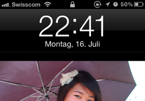
Bin ich der einzige Mensch auf der Welt, welchen das Kerning der Prozentanzeige auf dem iPhone 4S (iOS 5.1) stört? Der horizontale Abstand zwischen den zwei Ziffern ist viel zu gross, wenn bspw. 50% oder 84% steht:
Nachtrag: Nein, das Thema scheint bekannt zu sein:
A while ago I noticed, that on iPhone 4 sometimes the battery percentage figures looked odd. They are unevenly spaced and seem to jump off the baseline of the font. I tried to narrow it down and found out that this only occurrs on the 4, not a 3GS running the same iOS. The main font-related difference between the two devices – as far as I know – is, that the 4 uses Helvetica Neue, rather than simple Helvetica. Other than that, the increased resolution of the 4 versus the 3GS could also make a difference.
Quelle: Battery Percentage Numbers look odd on iPhone 4 and 4S

